How to Print Family Photos: Sizes, Finishes, and What Actually Looks Good on a Wall
You have great family photos. They are sitting on your phone, or in a folder on your computer, and every so often you think about doing something with them. Printing them. Framing them. Putting them somewhere you can actually see them.
The problem is that printing feels more complicated than it should be. What size? What finish? Will it look good framed? Will the color look right? This guide answers all of that in plain language, so you can go from photos on a screen to prints on a wall without second-guessing every decision.
Start With the Right Size
The most common mistake people make is ordering prints that are too small for the wall space they have in mind, or too large for the photo they are working with. Here is a practical size guide for family photos:
4x6 prints are the classic snapshot size — the size that filled photo albums for decades. They are affordable, easy to order in quantity, and perfect for albums, scrapbooks, and smaller frames. If you want to print a batch of favorites from a family session or a vacation, 4x6 is your starting point.
5x7 prints are the step up from 4x6 — noticeably larger, suitable for a small frame on a shelf or a desk, and still affordable enough to order several at once. A good choice for a single standout photo you want to display without going full wall art.
8x10 prints are the traditional framed portrait size. They look intentional on a wall in a standard 8x10 frame, and they are large enough that facial expressions and detail come through clearly. For a family portrait you want to display prominently, 8x10 is the reliable choice.
11x14 prints start to move into statement territory. At this size, a family portrait becomes a centerpiece rather than just a decoration. If you have wall space and a photo that deserves it, 11x14 in a simple frame makes a genuine impression.
Canvas gallery wraps are worth considering when you want to skip the frame entirely. A canvas wrap is a finished piece of wall art — stretched over a solid wood frame, UV coated, and ready to hang the moment it arrives. They work especially well for larger images and rooms where you want something that looks more like art than a photograph.
Lustre or Pearl — Which Finish Is Right for Family Photos?
If you are ordering standard photo prints, you will choose between two finishes: Lustre and Metallic Pearl. Here is the practical difference.
Lustre is the right choice for most family photos. It has a subtle texture that sits between matte and gloss — rich color and sharp detail without the glare and fingerprint problems of a full gloss surface. Lustre handles well, looks clean in frames, and works in any lighting. It is our default finish and our most popular for a reason.
Metallic Pearl is worth considering when you have a photo with strong color and contrast that you want to really pop. The paper has microscopic metallic flakes in it that give prints a luminous, almost backlit quality. For an outdoor portrait with great light, or a candid moment with rich color, Pearl adds a depth that Lustre does not quite match. It has a high-gloss surface, so it shows fingerprints more readily — better suited to framed display than to prints that will be handled regularly.
Both finishes are printed on archival paper with archival inks, rated to last 100+ years when framed under glass and kept away from direct sunlight and moisture.
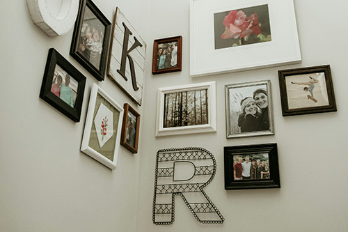
Building a Gallery Wall With Family Photos
A gallery wall — a curated arrangement of multiple prints on a single wall — is one of the most effective ways to display a collection of family photos. A few things that make gallery walls work:
Mix sizes intentionally. A wall of all identical frames looks like a grid, which can feel rigid. Mixing sizes — a larger 8x10 or 11x14 anchoring the arrangement, with smaller 4x6 and 5x7 prints filling in around it — creates something that feels collected and personal rather than designed.
Keep frames consistent. If you are using multiple frames, matching them — same color, same style — ties the arrangement together even when the photos and sizes vary. Black frames and white frames are both classic choices that work with almost any interior.
Plan the layout before you hang anything. Lay the frames out on the floor in the arrangement you are considering before you put a single nail in the wall. It takes five minutes and saves a lot of patched holes.
Leave breathing room. Prints that are too close together feel crowded. Two to three inches between frames is a good starting point.
Why Prints Look Different Than Your Screen — and How to Avoid It
The most common disappointment with printed photos is that the color looks different from what you saw on screen. There are two main reasons this happens.
First, most monitors are not color calibrated. The color you see on your screen is influenced by your monitor’s settings, the ambient light in your room, and the manufacturer’s defaults — none of which are standardized. At Yellow Lab Imaging, our monitors are hardware-calibrated using a Datacolor Spyder 5 Pro that reads both monitor output and room lighting. We also apply the ICC profile specific to each paper type when we print. That combination is what accurate color reproduction actually requires.
Second, screens emit light while prints reflect it. A photo on a bright screen naturally looks more vivid than the same image on paper, which only reflects ambient light. This is normal — prints are not supposed to look exactly like a screen. But if color accuracy matters to you, our optional color correction service is worth adding to your order.
Ready to Print Your Family Photos?
Yellow Lab Imaging is a small, owner-operated online photo lab. Every order is reviewed by a real person before it goes on the printer. We ship nationwide — free shipping on orders of $25 or more.
Browse our photo prints online, explore canvas gallery wraps, or contact us if you have questions before ordering.